Design kit
The parts
Everything the site is made of, rendering live. Not a description of the components — the components. If something here looks wrong, it's wrong on the site too.
The rule about green
Orange is the brand. It carries links, buttons, kickers, emphasis — the great majority of everything coloured on this site.
Green is rationed, and it means something. It appears in exactly four situations: the Z in the mark, the Z in the wordmark, something that is live, and something that has been granted (a copied prompt, a finished item). If you're reaching for green and it isn't one of those four, the answer is orange.
Colour
Every value was measured against the two backgrounds it can sit on, not picked by eye. The previous light theme failed WCAG AA on links (3.59:1), kickers (2.14:1) and the wish quotes (1.41:1) — which is why the quotes were unreadable. Small text needs 4.5:1.
- Accent
--accent#ff7a1fdark#9c3f06lightOrange as TEXT and as a border — links, kickers, hovers. Theme-aware because #ff7a1f is 2.14:1 on light, which you cannot read.
- Accent soft
--accent-soft#ffb765dark#8a5320lightSecondary warm text: the wish quotes, inline code, a definition line.
- Orange
--orange#ff7a1fdark#ff7a1flightOrange as a SURFACE — button fills, the logo, the skip link. Same in both themes because it always has dark text on top.
- Green (text)
--green-text#6bd97ddark#1f7038lightThe Z, live, granted — when it is text.
- Green
--green#6bd97ddark#2e9d54lightGreen as a fill and in the mark. Never small text on light.
- Deep
--deep#0c0a07dark#f6f1e6lightThe page background.
- Ink 2
--ink2#1d160fdark#eae1cflightPanels and cards — the harder background to pass contrast against.
- Paper
--paper#f3ecdddark#211a11lightPrimary text.
- Prose
--prose#d8cdb9dark#3b342clightBody copy.
- Muted
--muted#9c9080dark#6b6151lightSecondary text and captions. 4.6:1 on the panel.
- Line
--line#2c2218dark#dccfb6lightHairlines and card borders.
The mark and the wordmark

Full set of twenty candidates, colours and usage rules: the brand kit.
Type
Righteous — display
System UI stack — body copy. Fast, familiar, nothing to download.
ui-monospace — only for things that are literally code
LABEL / KICKER — body face, uppercase, tracked
Monospace means this is literally code — commands, prompts, file paths. Never decoration: setting UI labels in a code face makes a site written for non-developers look like a developer tool, which is the opposite of the point.
The icon library
56 shapes, hand-drawn on a 24×24 grid for a 2px stroke, round caps and joins, all on the same optical weight — so any two sit together without one looking bolder. They inherit currentColor. Every one ships in the media kit as a standalone SVG, emitted from this same source, so the kit cannot contain an icon the site doesn't.
Navigation
Getting around. Arrows point where you go, chevrons point at what expands.
arrow-rightarrow-leftarrow-up-rightchevron-rightchevron-leftchevron-downchevron-uphomemenucloseexternal-link
The show
Streaming, recording, scheduling. `live` is the only one that ever gets green.
playpauselivevideomiccalendar
Wishes
The brand vocabulary — wishing, granting, favourites.
sparklesparkleslampwandheartstar
Machine
Terminals, files, repos — the things a prompt actually touches.
terminalcodefilefolderfolder-treedownloaduploadcopysavetrashrefreshsettingsgit
State & safety
Outcomes and warnings. `undo` earns its place: it is the question to ask before you run anything.
checkcircle-checkcircle-xwarninginfoquestionlockunlockshieldundoeyeclock
Reading & finding
Search, glossary, tags, feeds.
searchbooktaglinkmailrss
Theme
The dark/light toggle, and nothing else.
sunmoon
Components
Buttons
Tags
Card
Code block, with its copy button
Every code block in rendered content gets one. The prompt is the single thing a visitor has to get out of a project page intact, and selecting thirty lines in a scrolling box on a phone is genuinely awful. It turns green on success — a granted wish.
echo "the copy button is added at runtime, to every block"Artwork
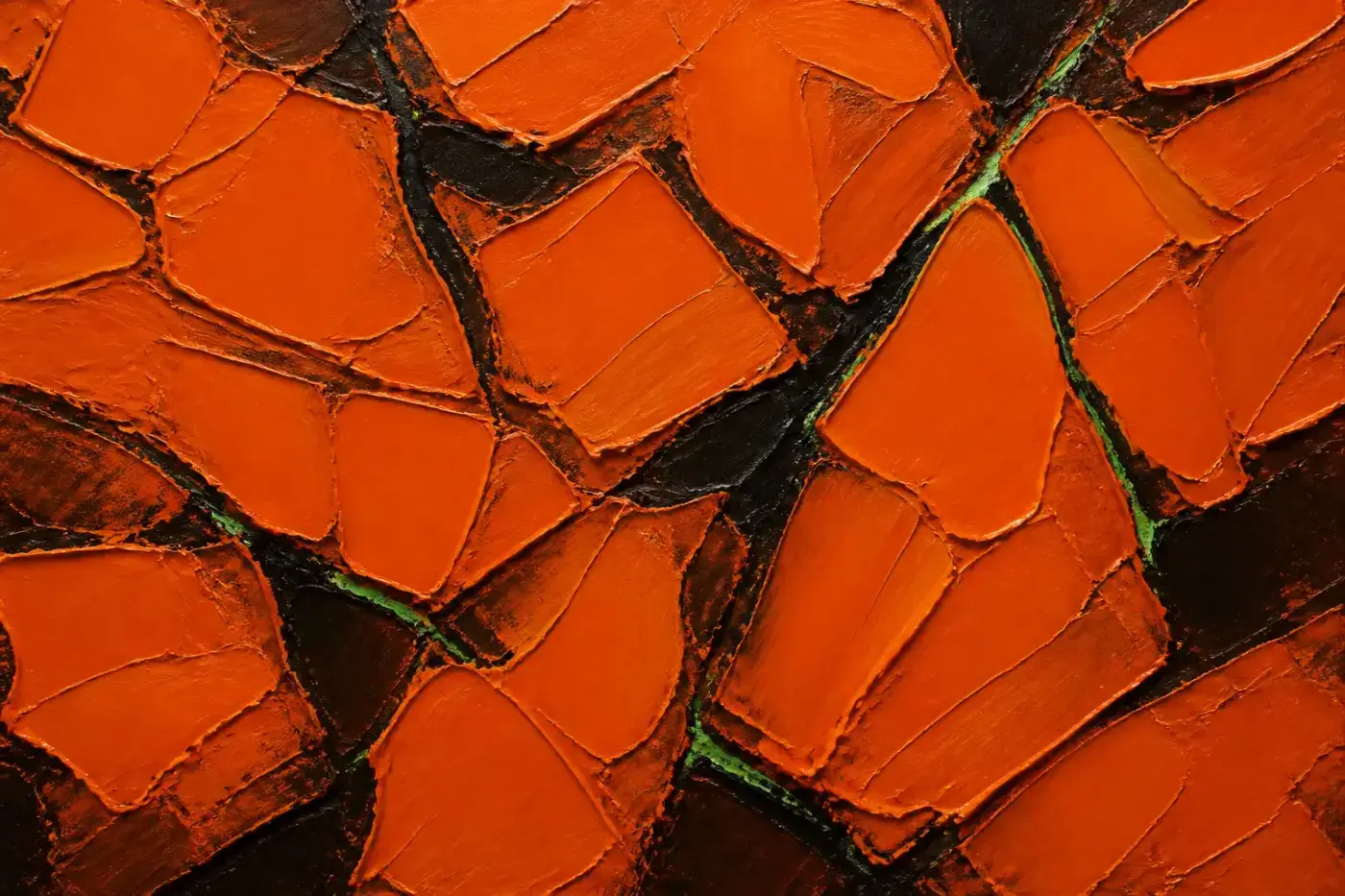
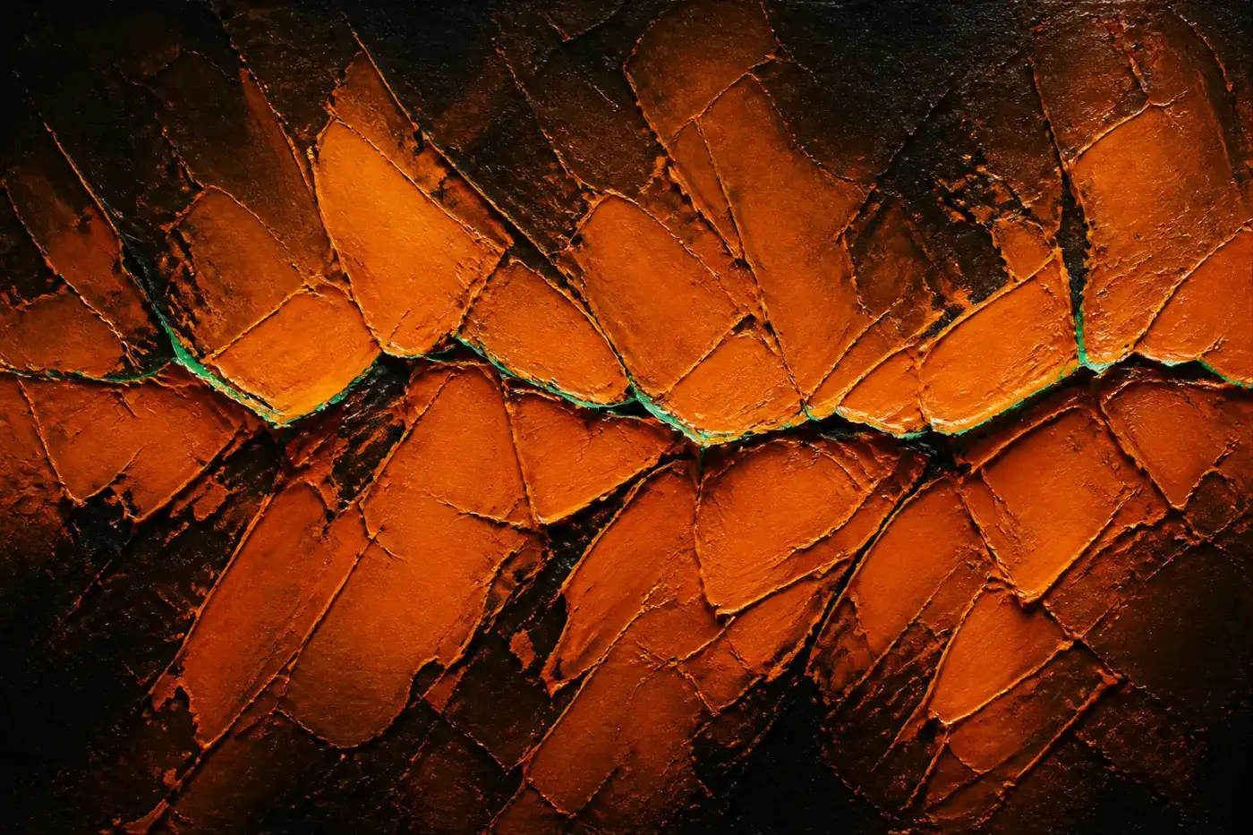
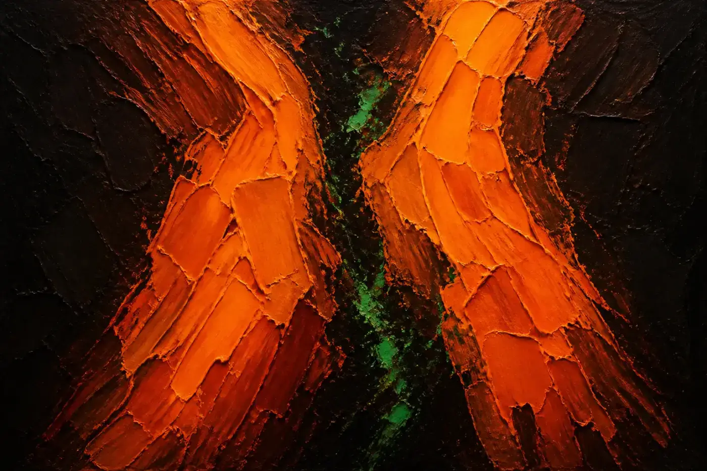
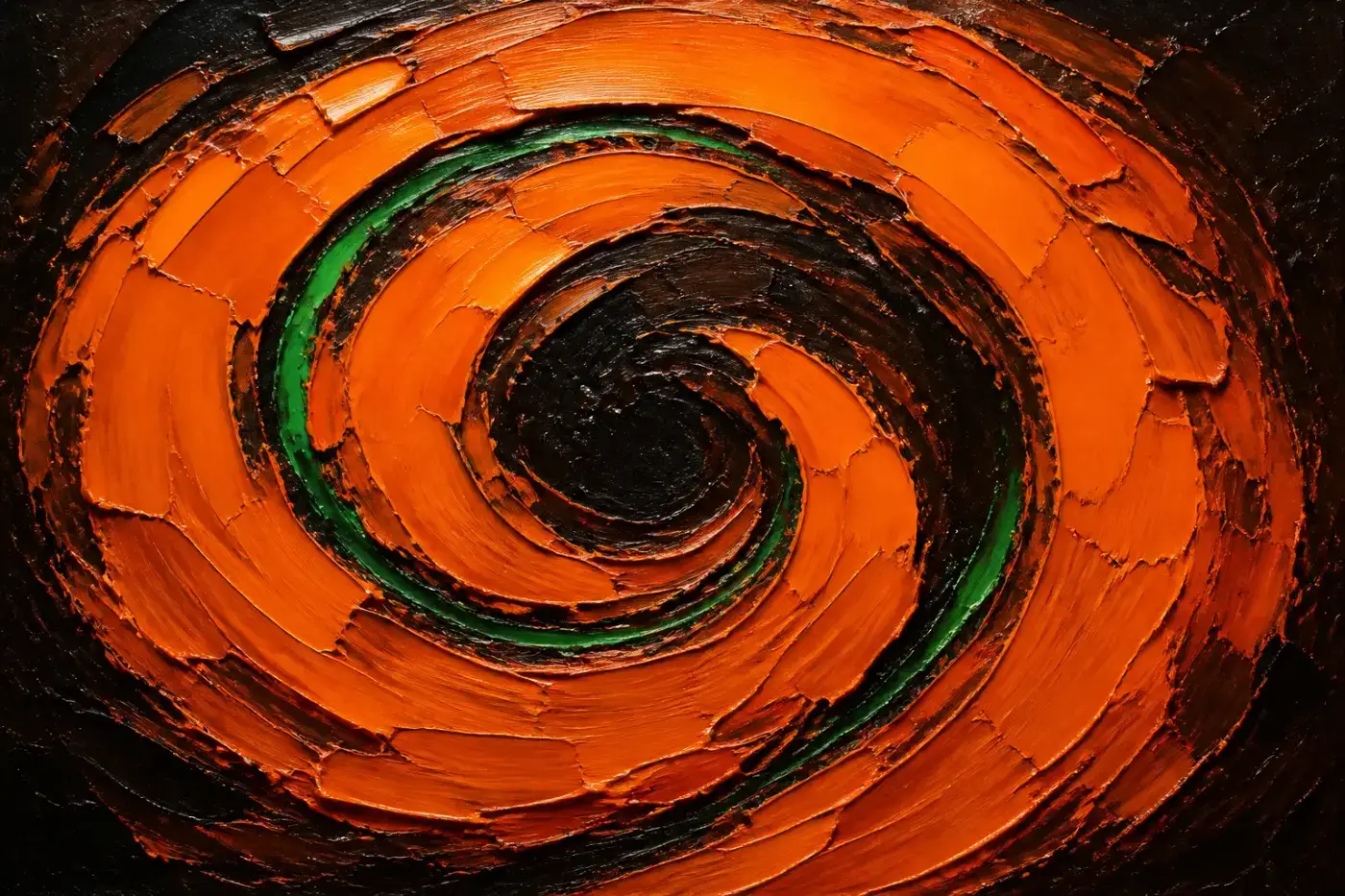
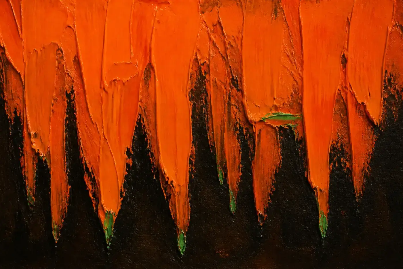
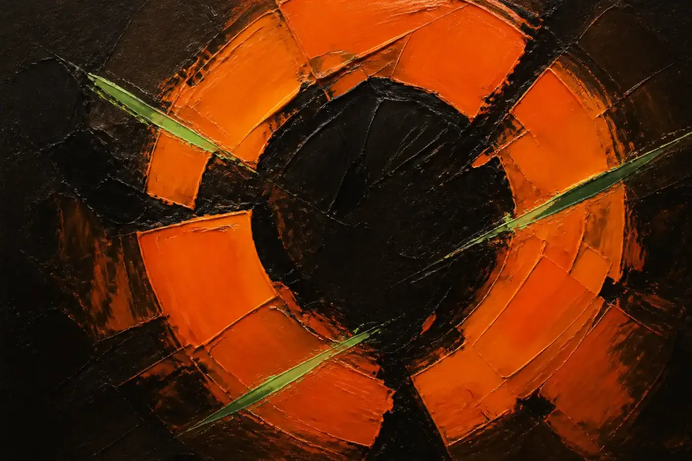
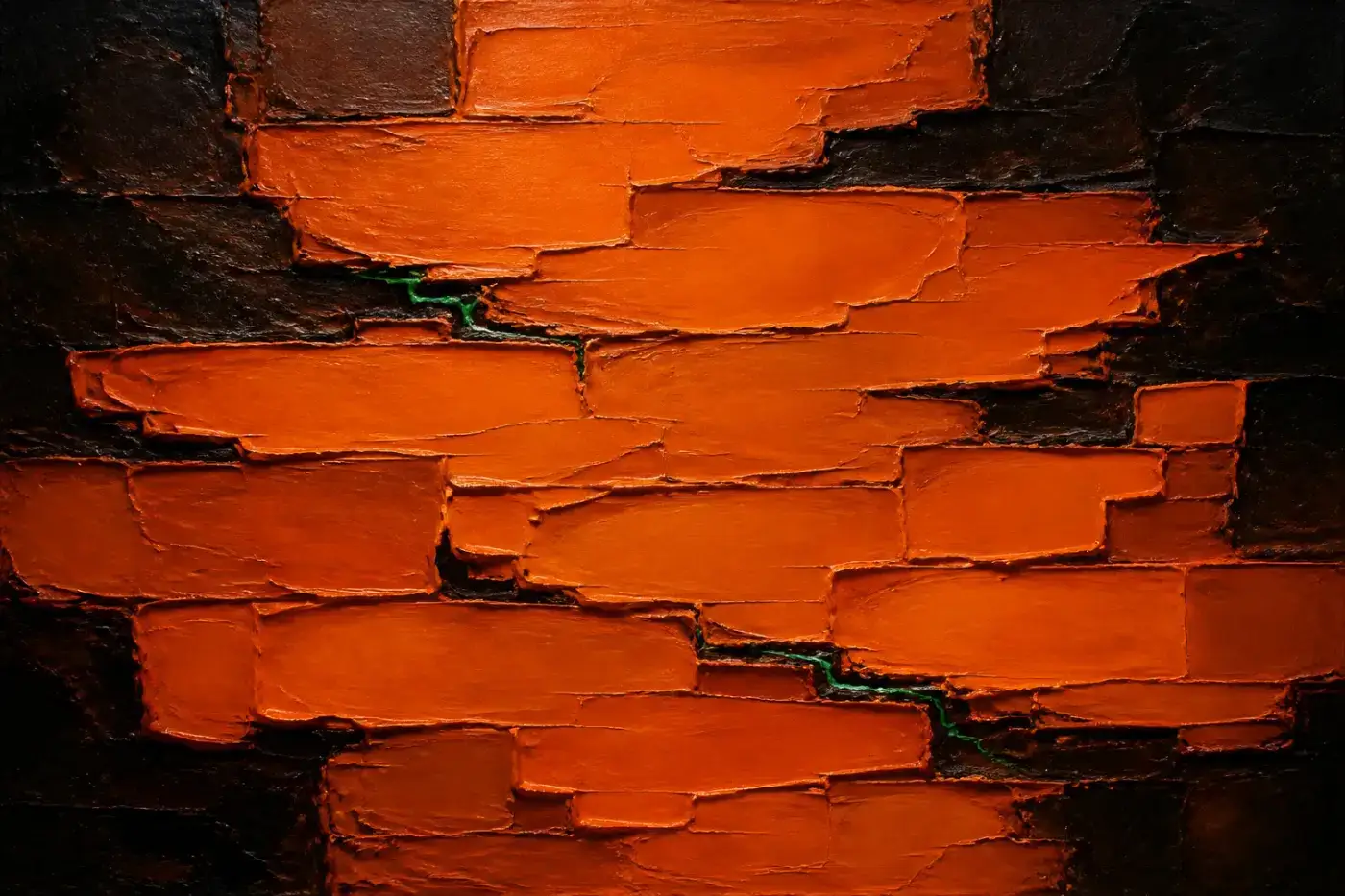
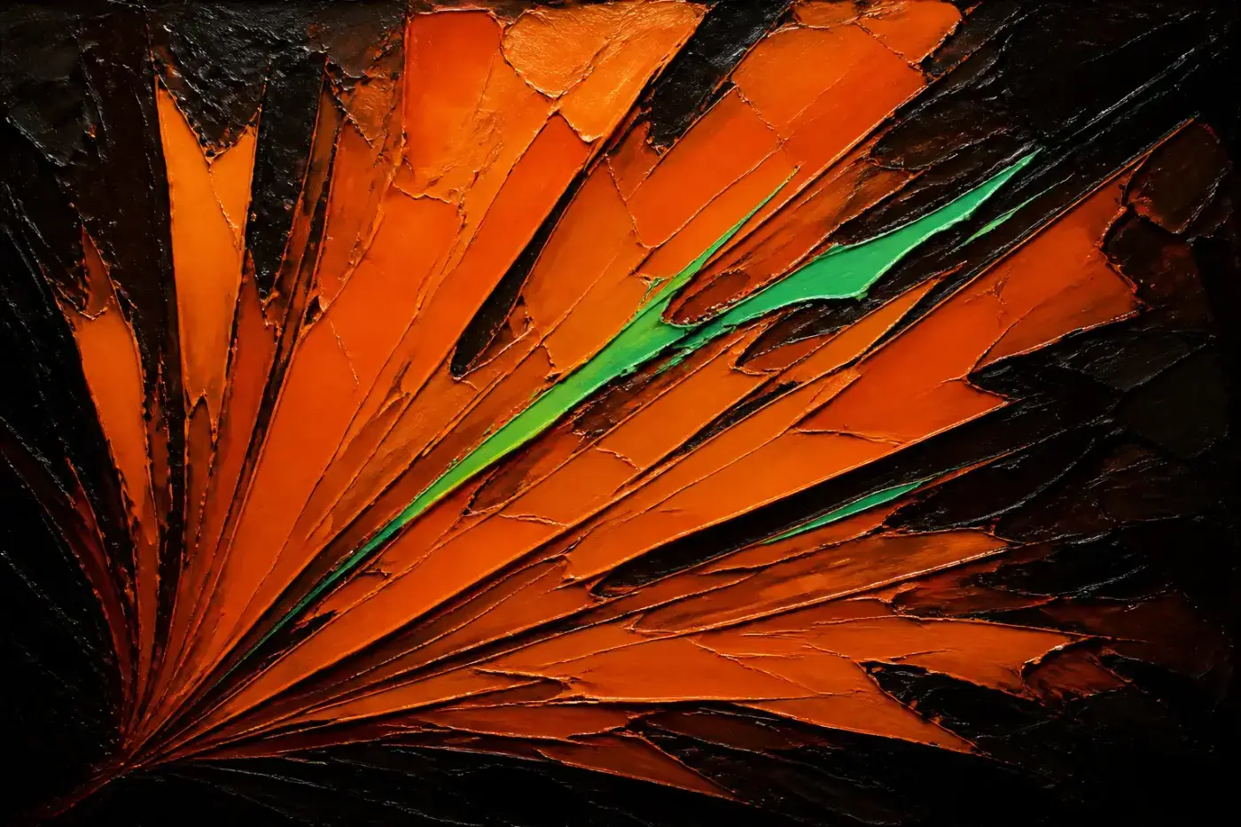
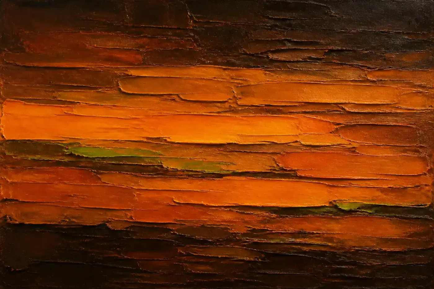
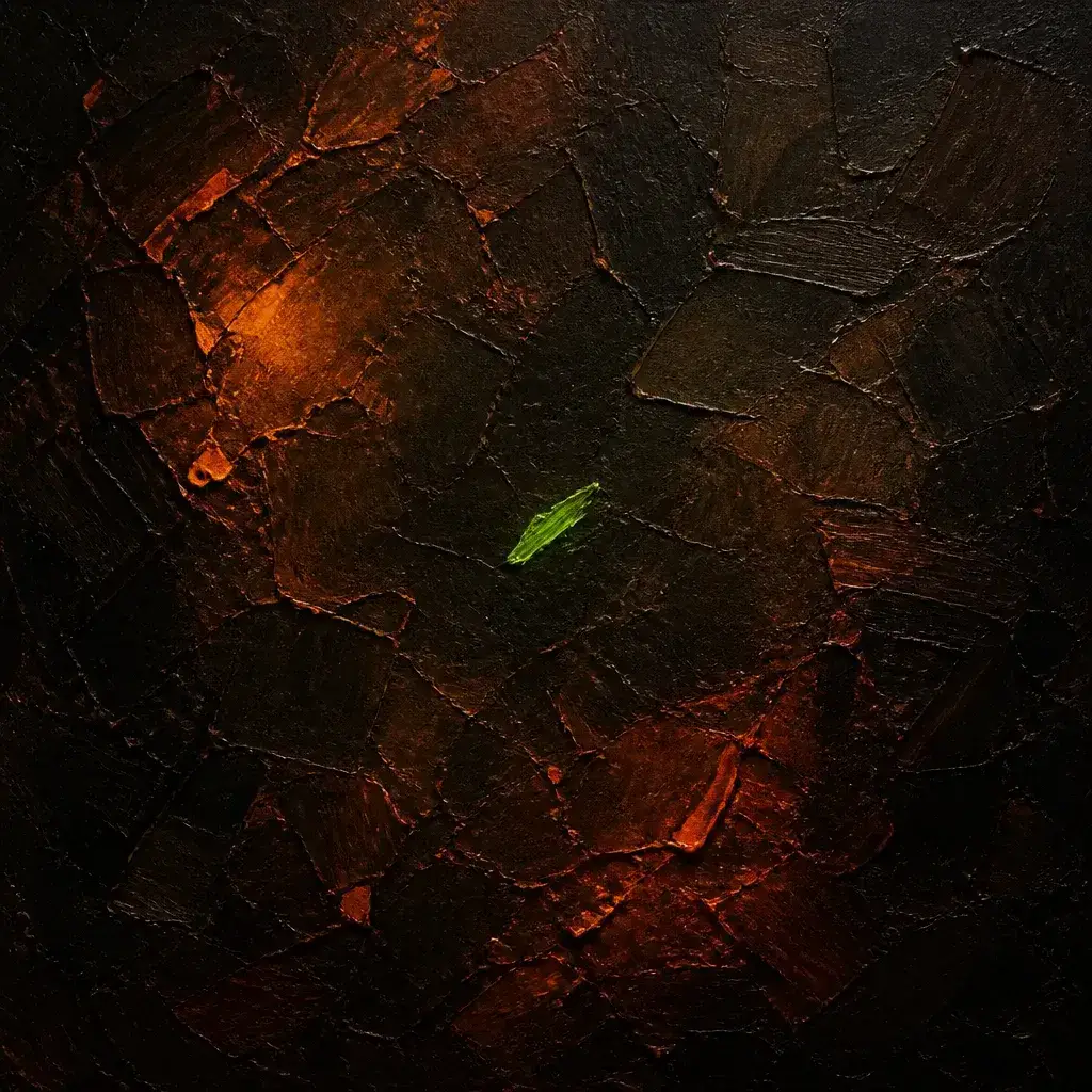
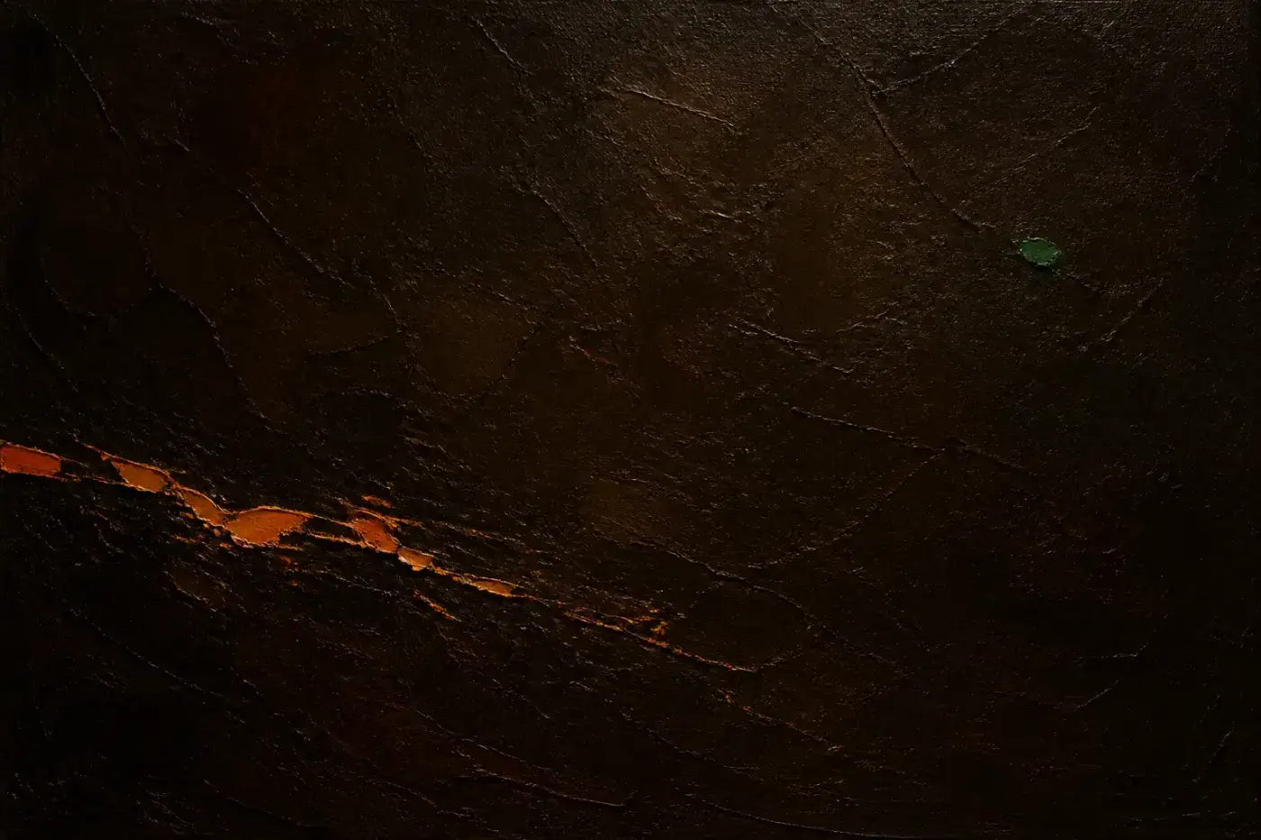
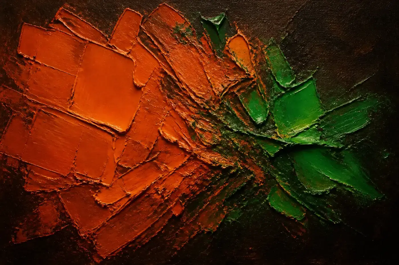
Abstract oil paintings, generated against a fixed brief: orange dominant, green at five to eight per cent, meeting along a seam where the two fight. The ratio is the brand rule restated in paint — which is why none of them is half green. Regenerate with node scripts/art/generate.mjs; the concepts live in scripts/art/concepts.json.
Every page
All 14 of them, live. These are iframes of the real pages, not screenshots — a screenshot is a picture of the site as it was the day someone last remembered to retake it. Click any one to open it properly.
/The pitch, the live card, the mark explained, latest projects, glossary chips.painting: faultlines/projectsOne project = one wish. The card leads with the wish in the viewer’s own words.painting: crestfall/projects/put-the-genie-in-the-boxThe prompt with its copy button, what you need first, and the honest bits./updatesThe update channel — dated notes, in the same RSS feed as the projects.painting: stitchedPlates/updates/the-site-is-upOne dated note. Same prose and code styling as a project./glossaryEvery word, one line each.painting: words/glossary/agentWhat it is, why it matters, an analogy that holds up./nowWhat’s happening. One hand-edited file.painting: granted/aboutWhat it is, what it isn’t, the name, the as-is note.painting: yieldingCoil/mediaThe marks, the downloadable media kit, colours, type, usage./designThis page./privacyWhat the site collects, which is close to nothing./searchOrama, entirely in the browser. Ctrl-K anywhere./404The wish that didn’t come true.painting: lost